Visual identity and motion system for Shaping Sustainable Places, a podcast by Skanska
Year
2026
Client
Skanska
What We Did
Shaping Sustainable Places is Skanska's B2B podcast, launched in 2023 to accelerate the shift toward a more sustainable, resilient, low-carbon built environment. Until this day (090926), across 46 episodes it has reached over 120,000 downloads on Spotify and Apple Podcasts and over 7 million views on YouTube, with listeners spanning the US, UK, Sweden, Poland, and beyond. Its core audience is industry and civic leaders across construction, commercial, and residential sectors, along with policymakers and the wider community.
The brief
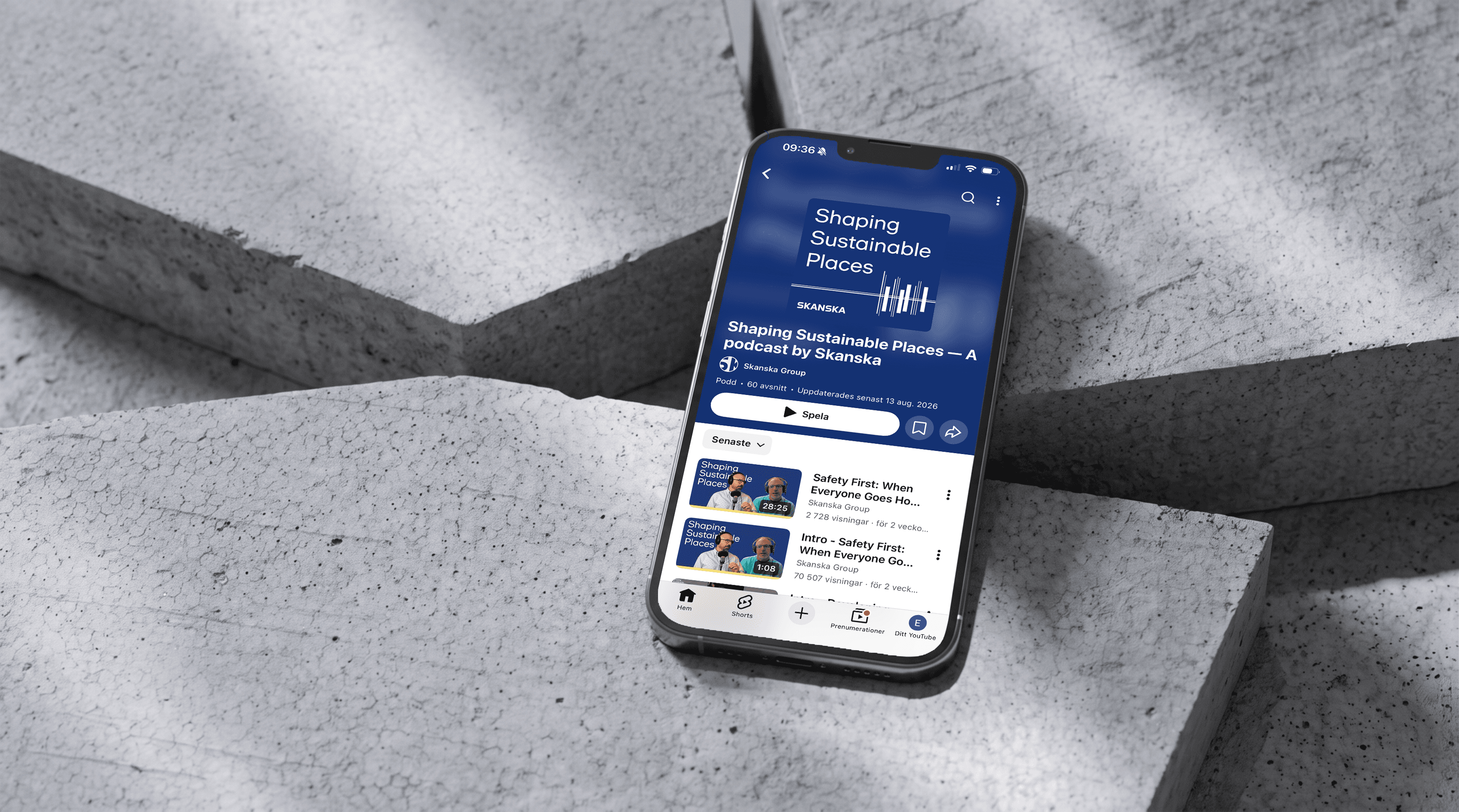
As the podcast moved from audio-only to video, Skanska needed a visual identity that could keep up. The goal was to make the podcast instantly recognizable in social and video feeds, identifiable within the first seconds, and consistent across every format it appeared in.
The challenge
An identity originally built for audio now had to carry a fully visual, video format, without losing its connection to the podcast as an audio experience. It needed to hold up in miniature (app icon) and at scale (video, motion, print, social), while still reading as a large, established company rather than trend-driven.
Just as important: this wasn't a sub-brand exercise. The goal was a brand extension of Skanska's core identity, not a disconnected visual system that would date quickly. It had to be built to last. We needed an expression that read as sound rather than just graphics, while staying rooted in what Skanska actually does – construction and development – and one flexible enough to carry video content.
The identity had to work everywhere: as a small YouTube thumbnail, an ad in a LinkedIn feed, a video teaser, and in a physical studio. It needed to feel current and give the podcast more energy and editorial freedom than Skanska's usual corporate channels, without losing its connection to the brand.



Our approach
Guiding principles
To keep decisions consistent as the identity took shape, we defined eight guiding principles together with Skanska, split into two types. Objective principles are grounded in landscape and performance, they define what has to work: standing out from category conventions, working with the algorithm's context, building a flexible system rather than isolated elements, and staying legible at thumbnail size.
Subjective principles define how the identity should feel: matching the seriousness of the content without becoming corporate, staying rooted in Skanska's blue while leaving room for energy, doing more with fewer elements, and putting the people, especially the guests, at the center.
Together, they gave us a shared checklist to test every decision against, from typography to how a single frame looks on YouTube.
The visual identity
We developed a visual identity system built around a waveform mark that does double duty: it reads as a soundwave, but its shapes also resolve into a skyline and a bridge. Sound and structure in one mark, a direct link between the podcast format and Skanska's construction and infrastructure business.
We also put the guests front and center. Giving each episode a face made the content feel more personal and credible, and it invited people into the conversation rather than just presenting it to them. That sense of welcome was key to sparking real interest and engagement, and to getting people to actually watch or listen through a full episode, not just scroll past a clip. Everything was designed to work as content in the channels it lives in, while still feeling serious and true to both the company and its audience.
From the outset, the priority was an identity that could genuinely be applied in marketing, not just live as a concept on a moodboard. In a landscape where brand identities are increasingly expected to translate directly into usable assets, we grounded the system in real application from an early stage, meaning it could already be applied to the new video episodes, marketing materials, and content for owned channels as the identity took shape, rather than requiring a separate translation phase later.



Few but hard working
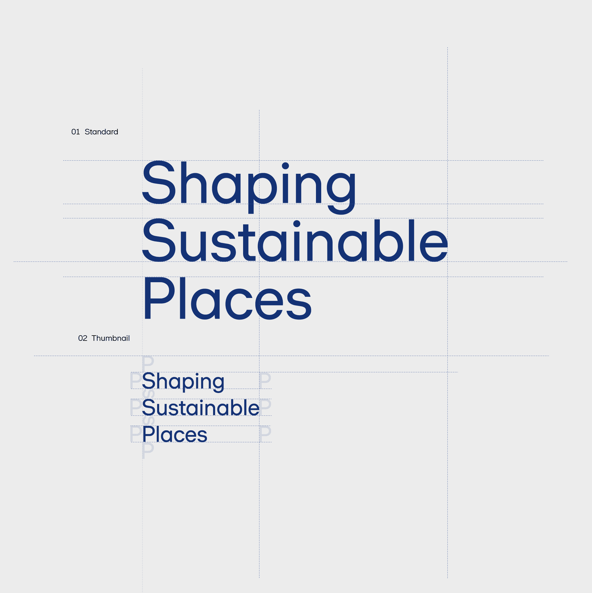
The guiding principle throughout was "few but hard working": few elements, but every part carrying meaning. This produced a scalable brand system that applies consistently across formats and channels, including video, without relying on decoration to stay relevant.
The result was delivered as ready-to-use assets and components alongside a complete five-chapter brand guidelines deck, giving Skanska the tools to manage and apply the identity independently going forward, across both video and static touchpoints.